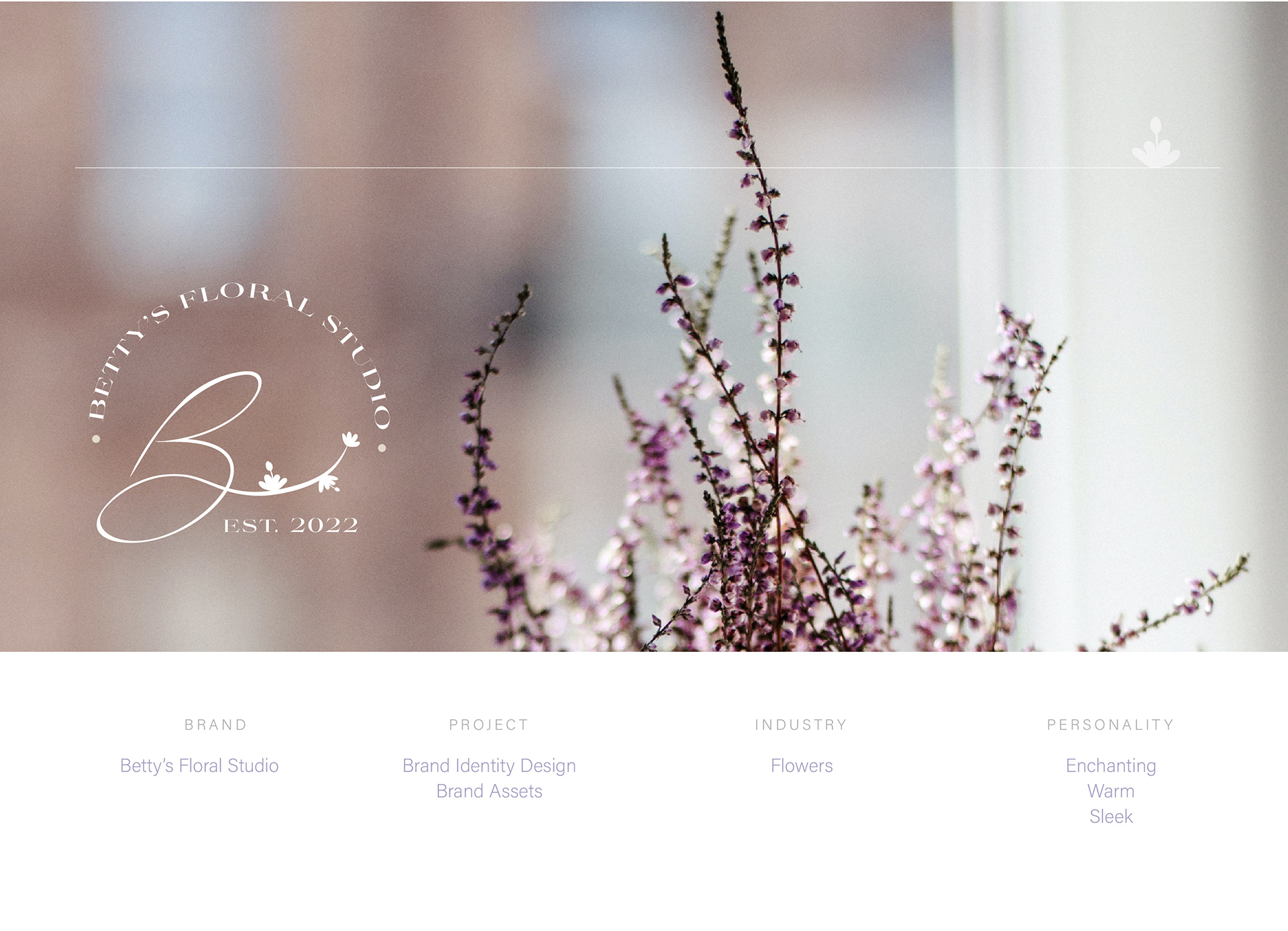

Betty’s Floral Studio is a charming flower store situated in Toronto. The client, a lovely young girl, has a deep affection for flowers because of the warm feelings and connections they bring to people's lives. She envisioned a logo for her store based on a cute tattoo she has, making the inspiration for the logo design crystal clear!

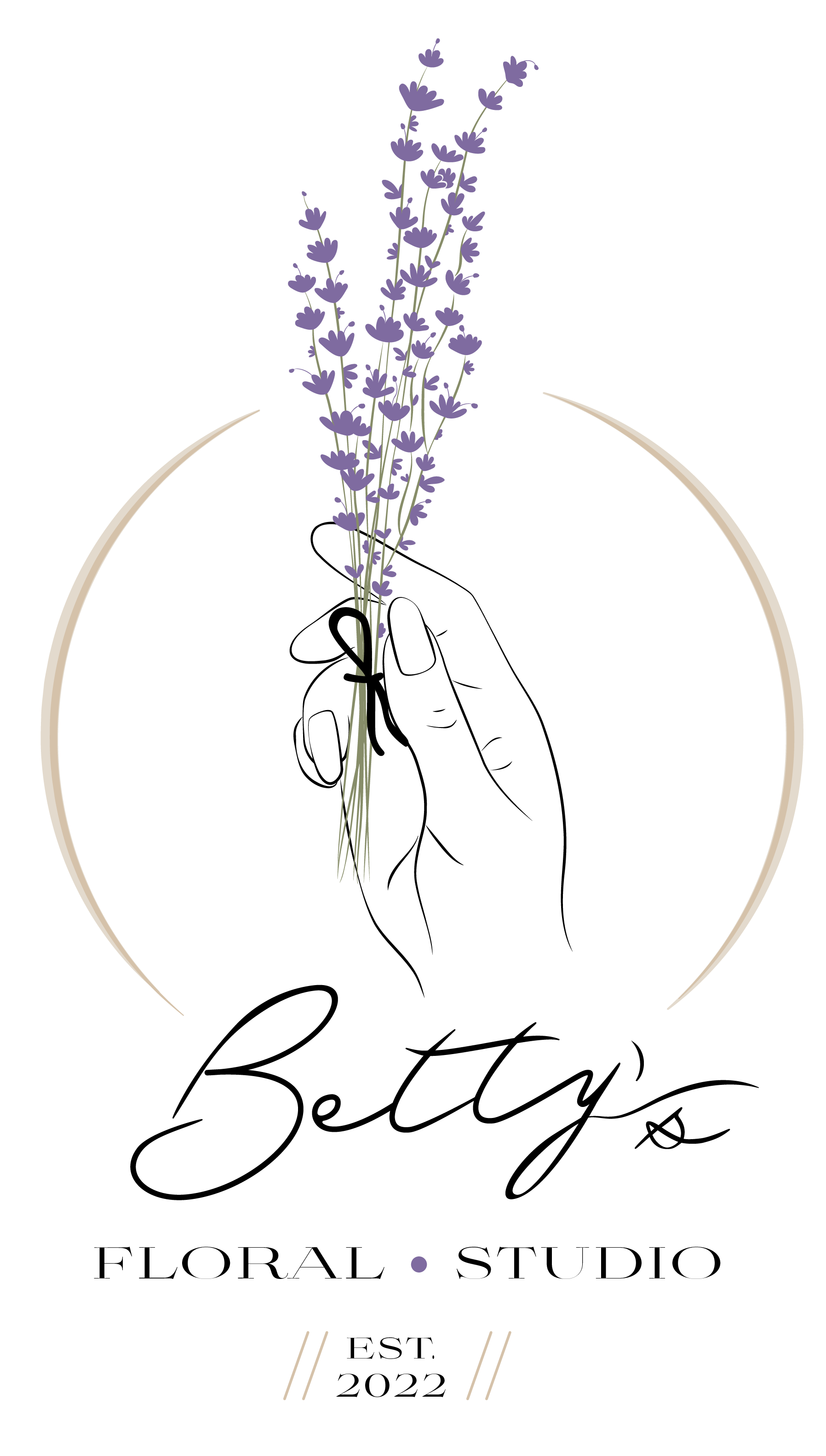
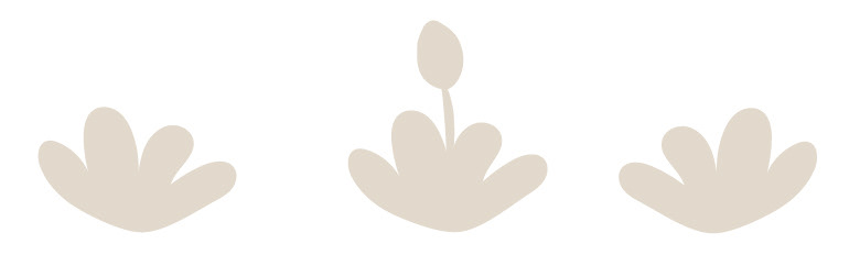
Here is the tattoo we'll be using as a reference for the logo. Based on it, I conducted some research to find a similar image and then traced it to create a beautiful vector that we can work with

After tracing the tattoo and preparing the vector, I worked on various layout options by combining the vector image with the store's name. This process resulted in four different options, which I will be presenting to her.

Option three was the winner!
Then I proceeded to create the secondary logo, sub-mark, and the favicon logos


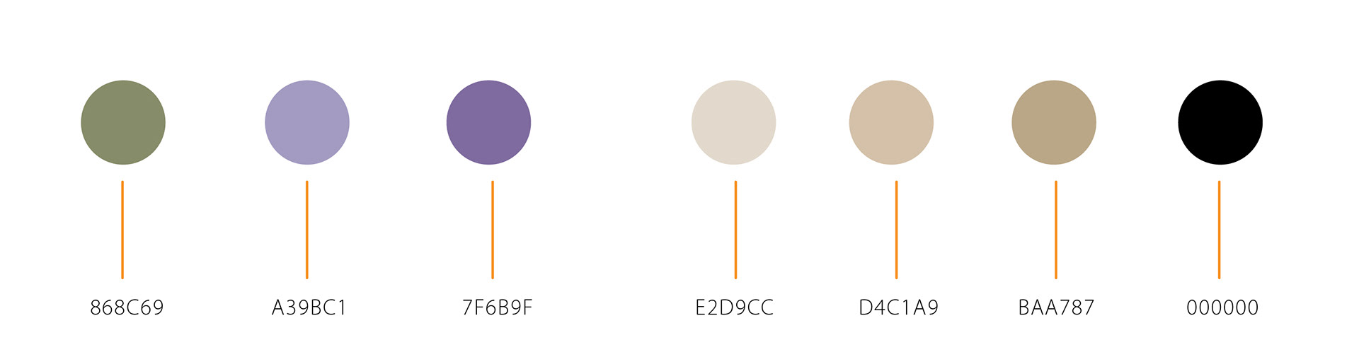
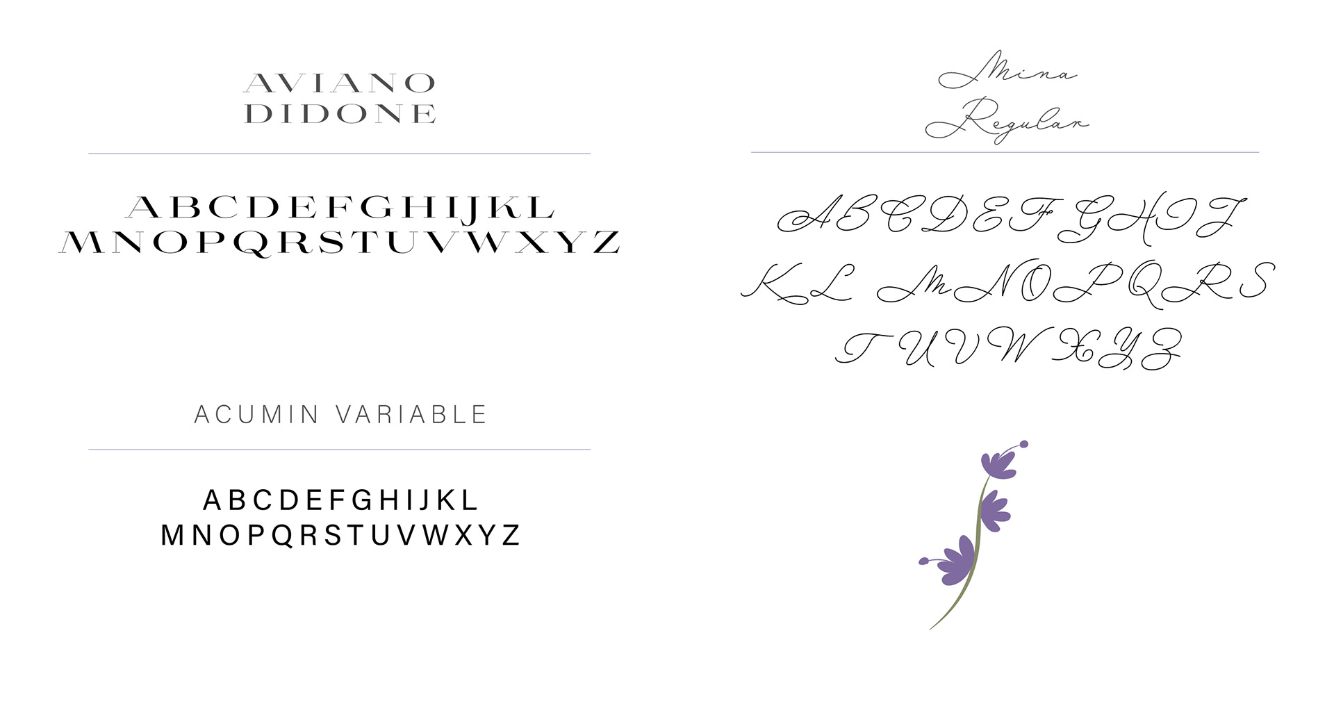
She had a clear vision of her color palette and even provided a guide with the tones she wanted for her branding. In addition to her palette, I incorporated a lilac and green from the original image, as the traced flowers are lavender. These colors complemented the ones she desired and resulted in a beautifully balanced color palette
For the logo name, she wanted a design that resembles a soft breeze and has a handwritten feel, so we opted for the Mina Regular font. As for the rest of the logo copy, we chose the font Aviano Didone, and for the social media artworks, we went with the font Acumin Variable.
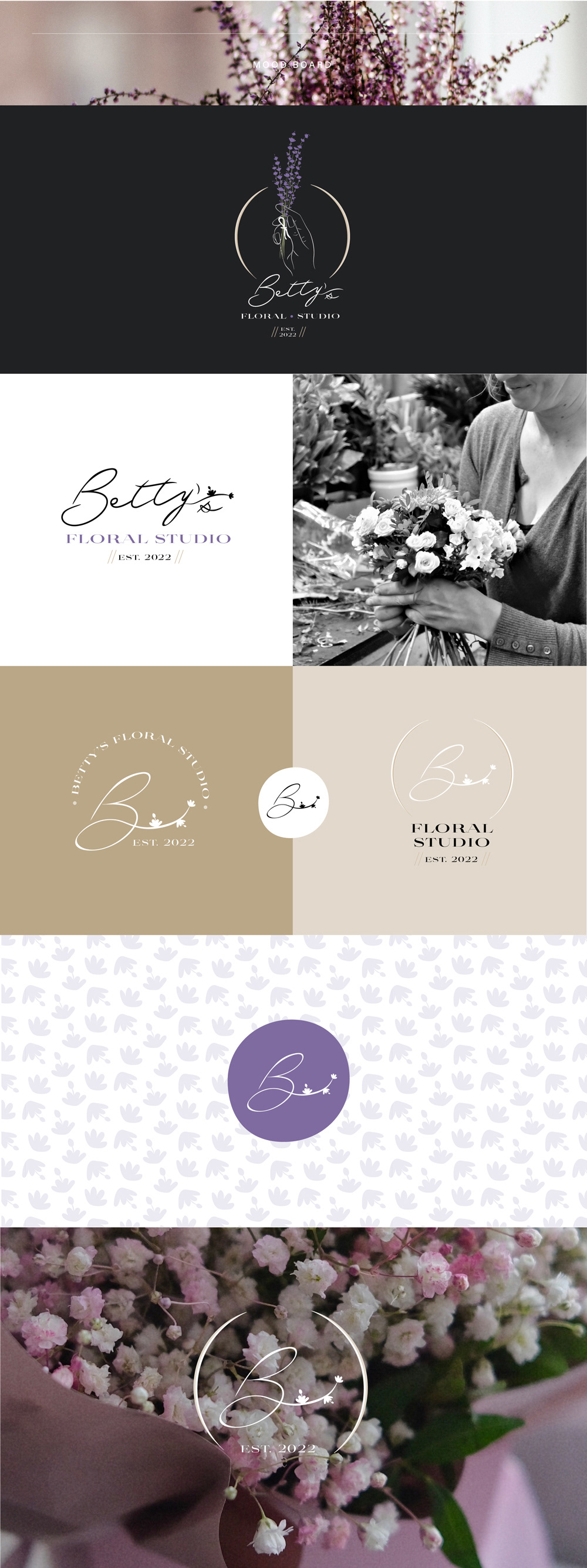
After finalizing the logos, colors, and fonts, we began designing some elements for the brand & a cute pattern made with one of the tiny flowers.

After completing all the elements, I created a mood board and brand assets