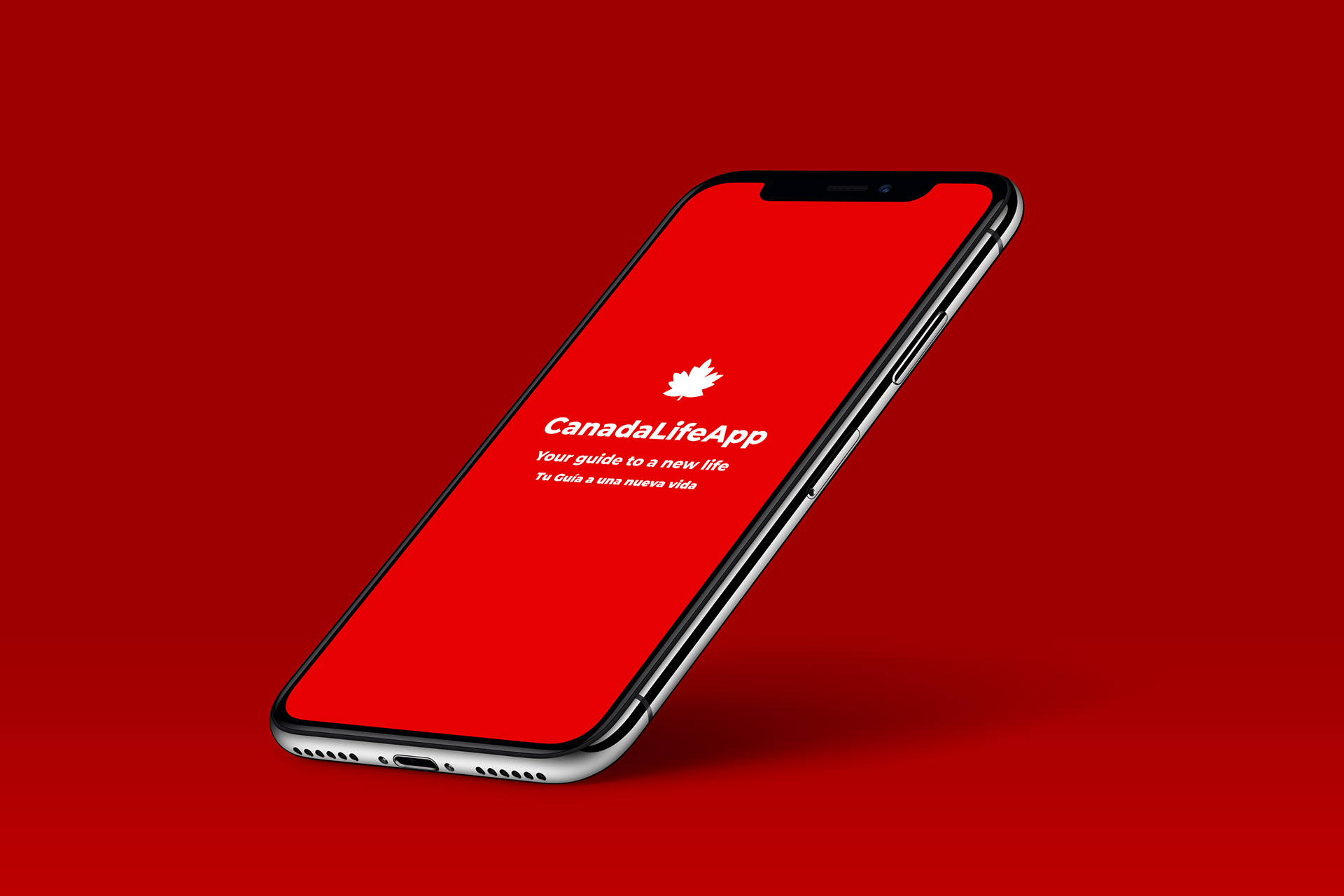
CanadaLifeApp is a directory & guide
for newcomers settling when moving to Canada.
Overview
The Project
CanadaLifeApp is the result of the seven weeks project for the Visual Design, Wireframes and Prototyping course in the UX Certificate at York University. The goal was to translate ideas and preliminary concepts into meaningful user interfaces to support business goals and user needs.
The Challenge
How can we make moving to a new country less scary for people who don't know the language?
I focused on a group part of the spectrum: people coming to live in Canada.
The Outcome
An app to guide people in the process of moving to Canada or are already here needing guidance in the settlement process. A tool to carry out the tasks required to start a new life in Canada.
My Role
Lead UX Designer / Research, Interaction Design, Visual Design & branding.
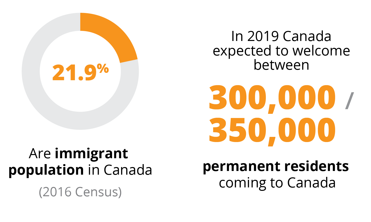
Research & Data
Potential Users of the Product
- Newcomers moving to Canada from a different language country.
- Any family member that does not know the language of the country they are moving in.
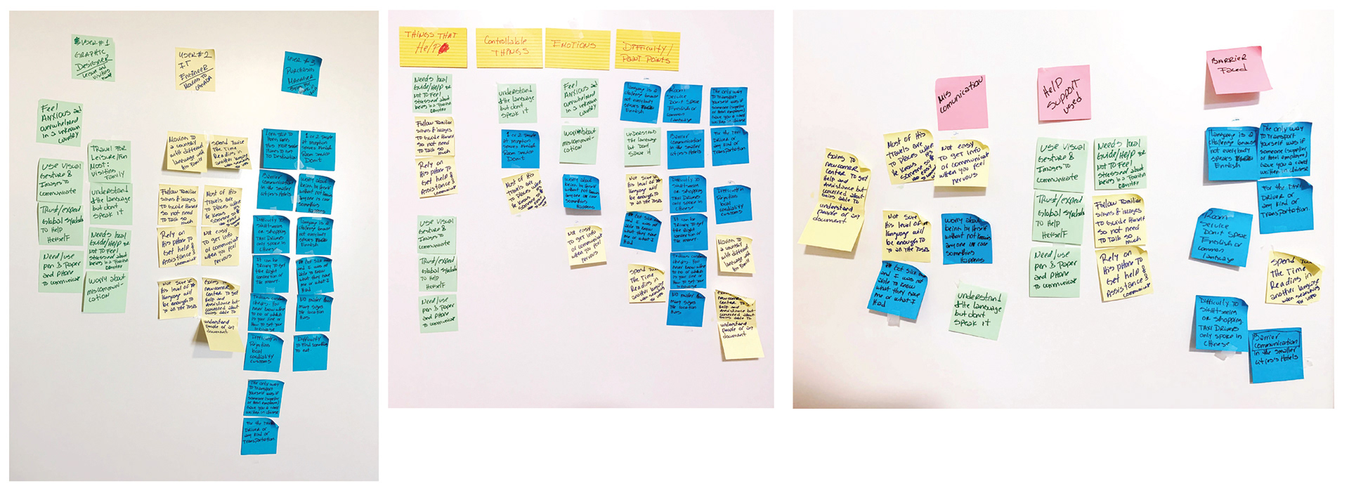
Interviews
To empathize with the audience, I conducted personal and online interviews with people who:
1- Were in the process of arriving in Canada, and
2- Who had just landed and were carrying out the settlement tasks,
3- Who volunteered in newcomer centres.
To talk to the right audience, I chatted with a volunteer with the settlement counsellor office at the Peel Newcomer Center getting first-hand the hardships and frustrations newcomers face.
After finishing the interviews, I did an Affinity Map to cluster the responses collected based on themes:
Business Problem
Newcomers faced fear and frustration when they cannot handle themselves in an unfamiliar environment with a different language.
They are unable to engage in any communication/interaction and to do any settlement’s tasks easily because of the lack of proficiency and fluency of the language.
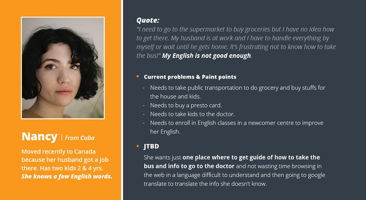
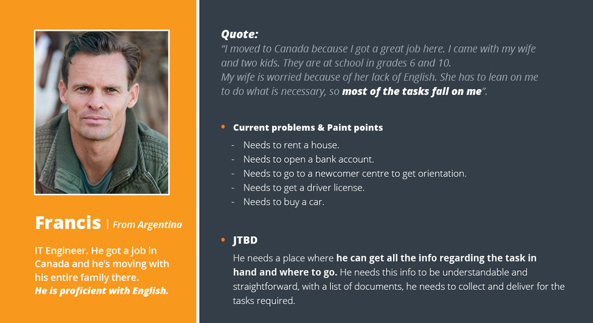
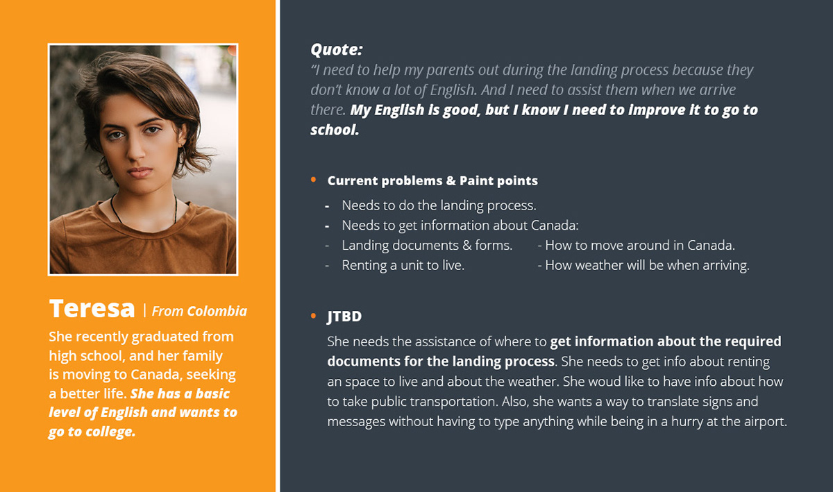
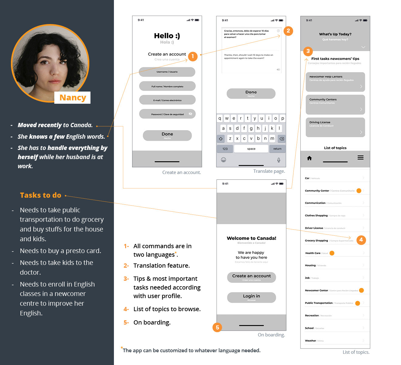
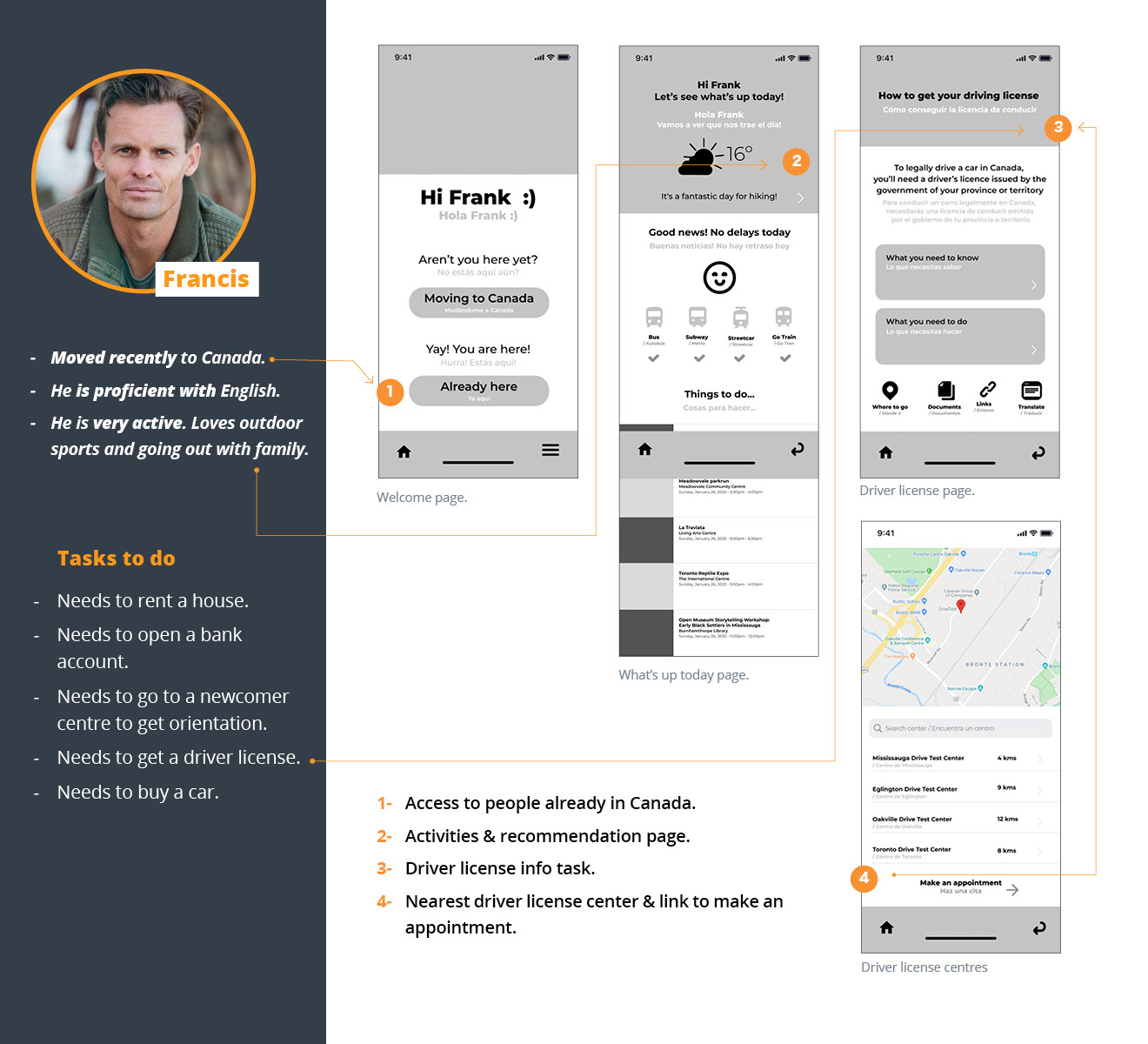
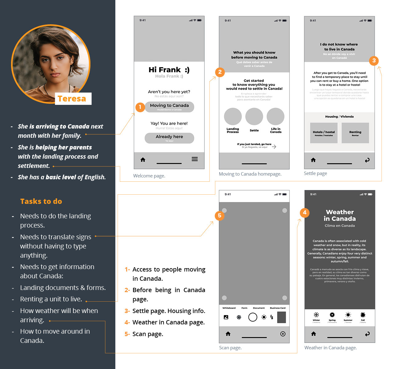
Personas, Pain Points & Jobs to be Done
Opportunity
Create an app to assist newcomers with their settlements required tasks.
This app will:
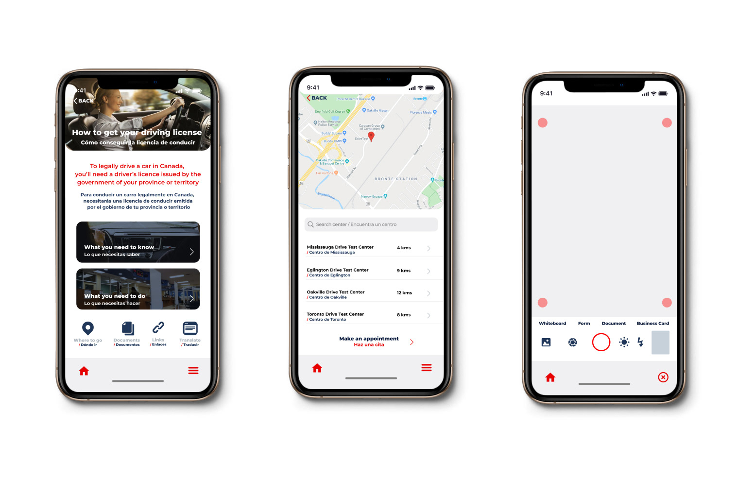
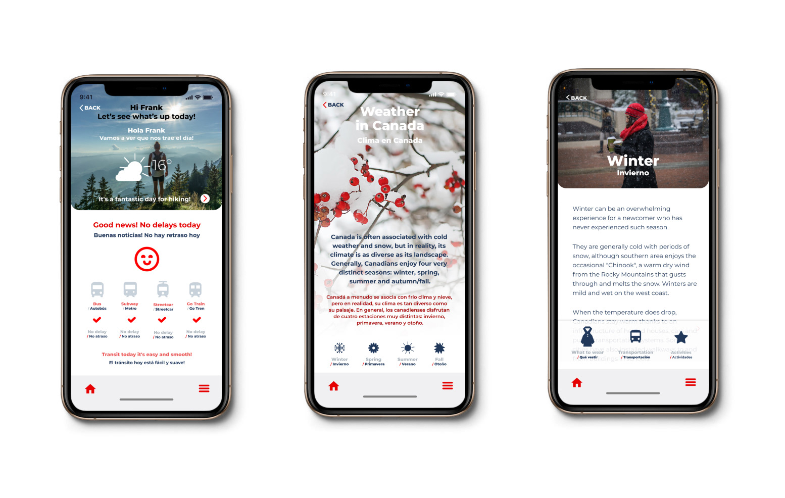
- Have a list of topics such as landing, settlement, grocery/shopping, school, transportation, banking, housing, jobs, health care, car, weather, recreation, etc.
- Have the steps required to do the task for each topic.
- Have a listing of the most common phrases needed to do the job in hand.
- Allow scanning signs, messages and documents to translate or keep them.
- Provide links/addresses and info on how to get to the places needed.
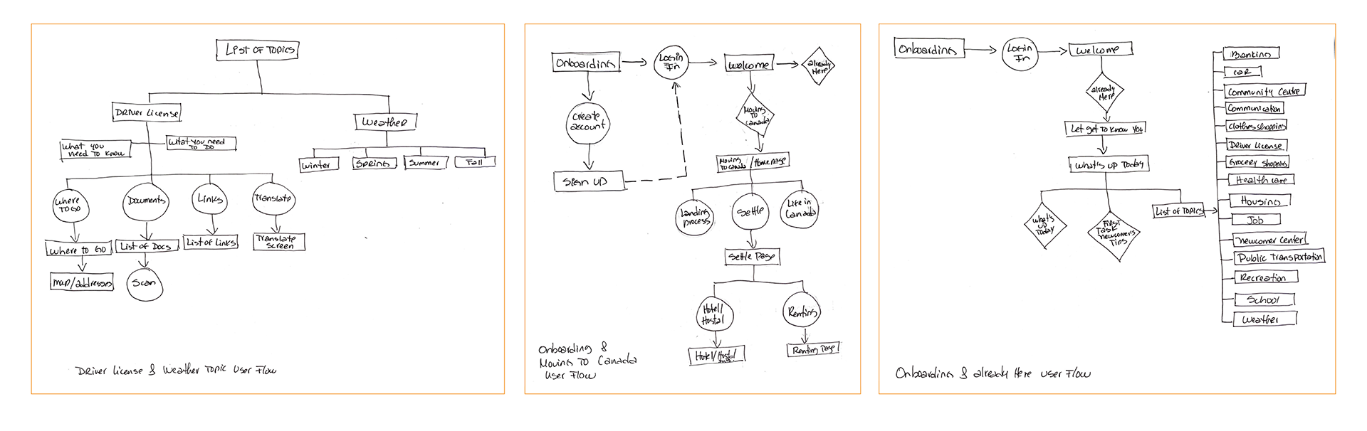
Design Kickoff, User Flow & Sketches
Crazy 8's workshop was the way to go for brainstorming ideas.
Some of the ideas and solutions that came from the Crazy 8's workshop were the following:
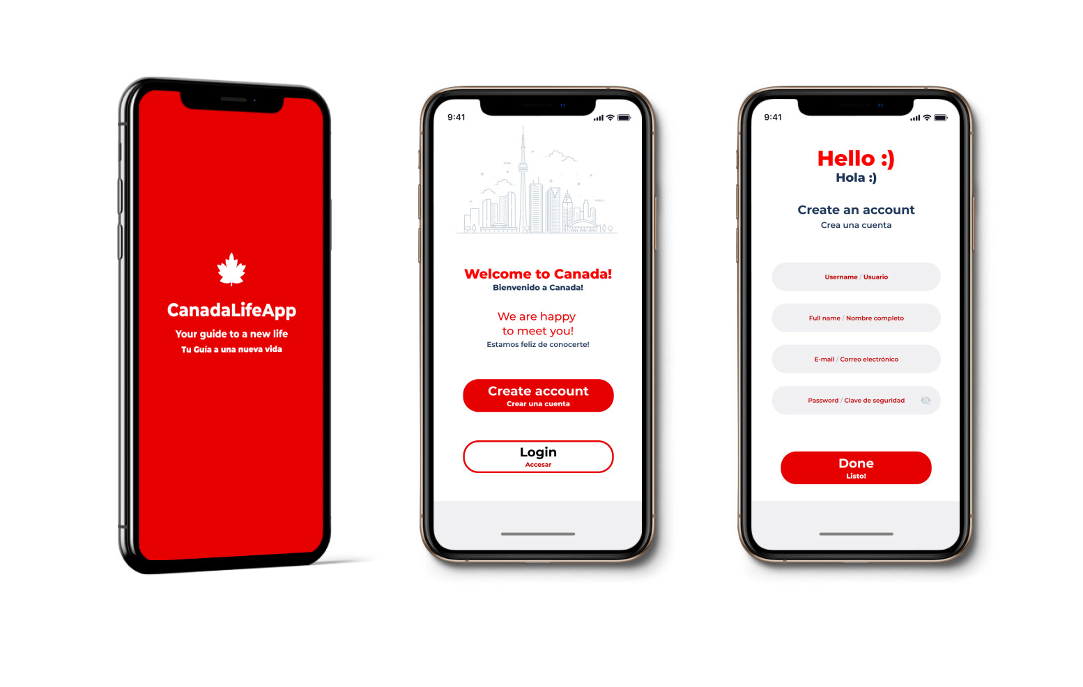
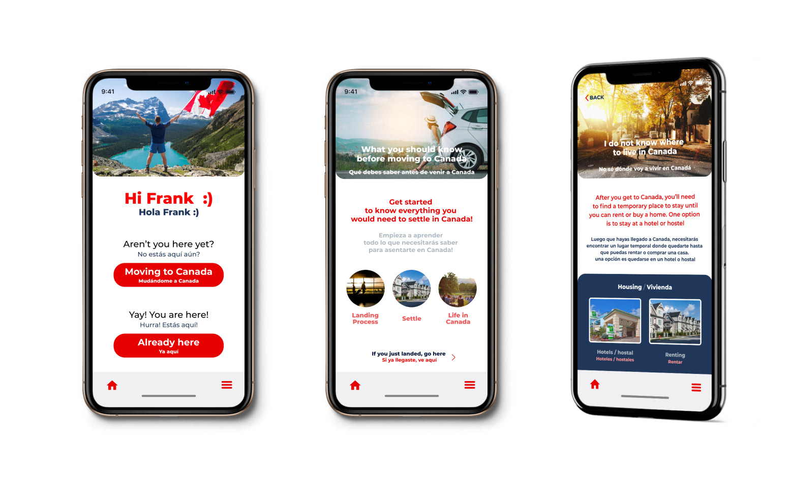
- On boarding page to ask if people were already in Canada or moving in.
- Add links to make appointments in specific pages when aplicable.
- A camera/scanning function to scan signs, messages or documents allowing to save them.
- Check list page.
- Push notification about local news, weather and events.
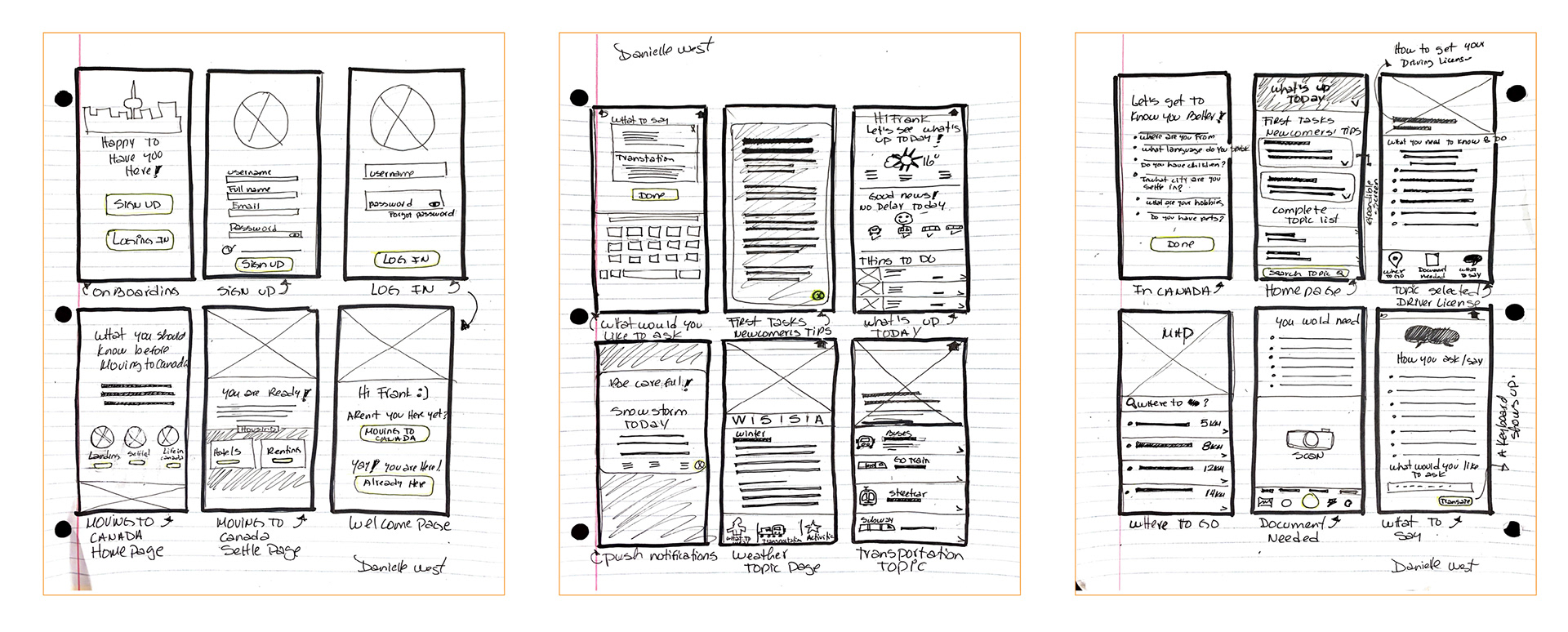
Mid-fidelity Wireframes & First Usability Test
Mid-fidelity wireframes were created in Figma.
All the features from the sketches were integrated in this stage of the project.
We performed an usability test observational session with three participants. They saw great value in the app and would like to have a tool like it to help the settlement process they went through.
I found some issues with the user flow of the app. However, participants were expecting the app to be fully clickable or interactive. They got confused a lot, trying to go to a place with no action incorporated at this time.
In general, they could use the app with no significant complications, icons were understandably, and topics were approved.
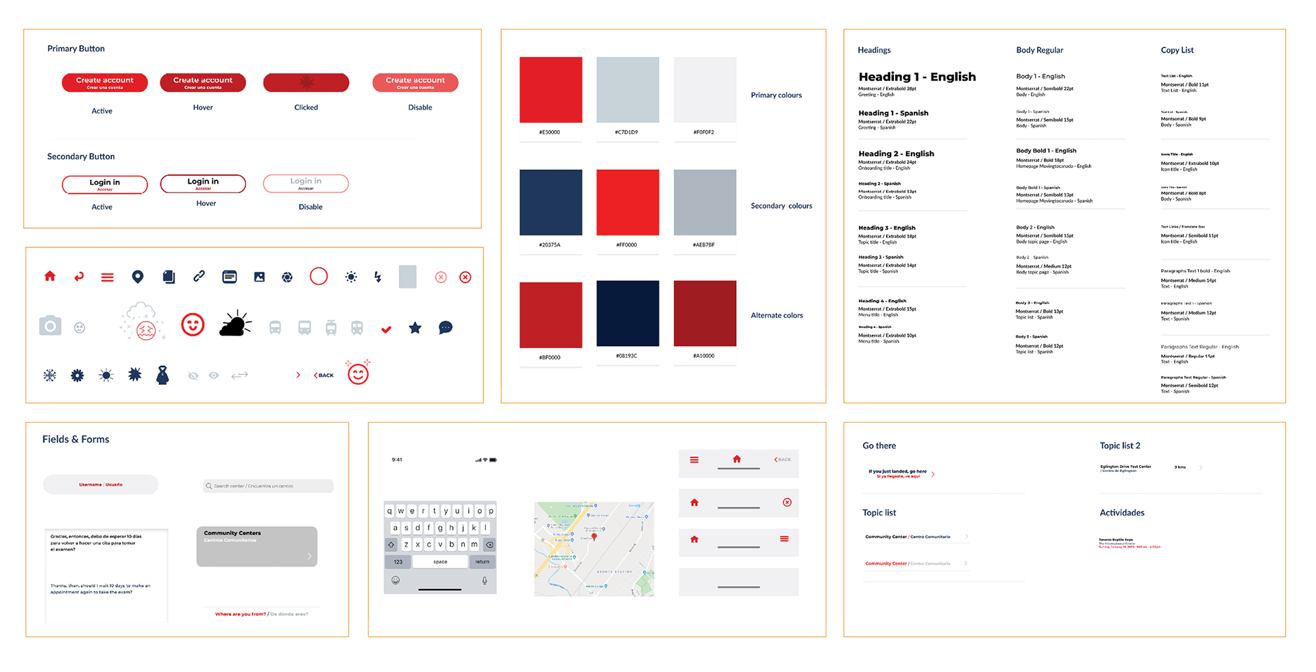
Look & Feel
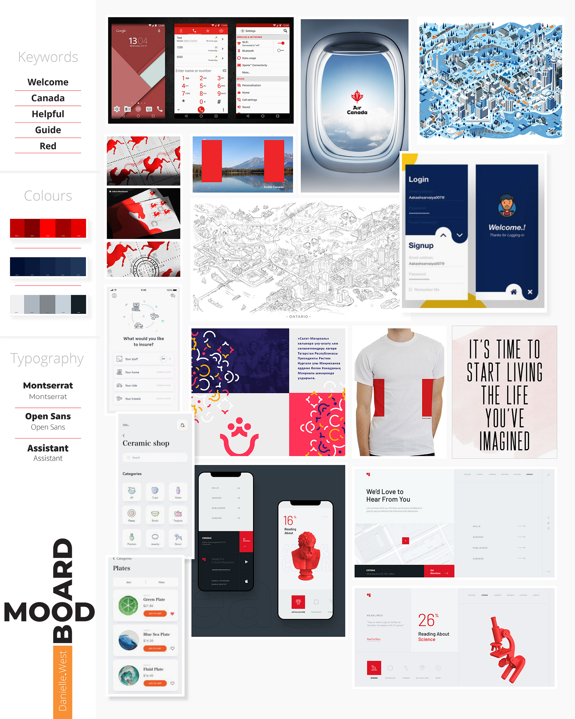
Mood Board and Design System
I created a mood board to have a better feeling about the look of the app.
I wanted it to be very "Canadian," so my main focus was it has to be clean & red.
Then, I created the Design System when building the high-fidelity wireframes.
High-fidelity Wireframes & Second Usability Testing
With the high-fidelity wireframes I ran an usability testing in Maze.
The main issues found were trouble going back from a screen and users knowing when scrolling down a page. Then I did another round of iteration with the feedback of the usability test.
Here is the result:
Knowledge acquired
The most valuable lesson learned during this project is that research is the key and base of a project. Research digs into the issues users face and provide insights to inform the right solution to the problem to solve. Designing a product without research that will provide a solid strategy to follow and a valid value proposition is a waste of time and resources.
What's next?
The final goal is to complete the design of the application in its entirety. Then develop it and deploy a beta prototype to collect information on better usability with real users. Then carry out the necessary iterations to be able to offer it to migratory entities.