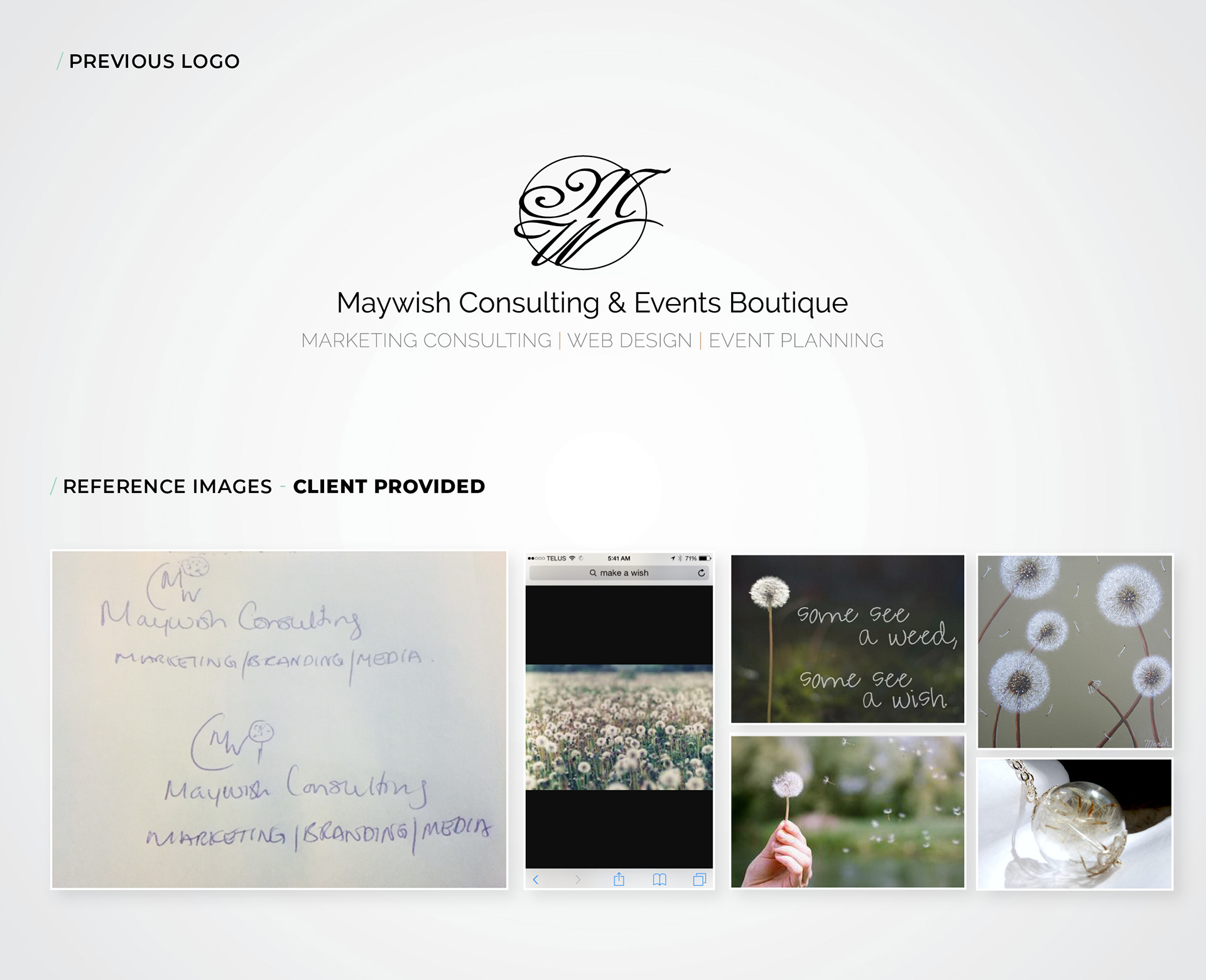
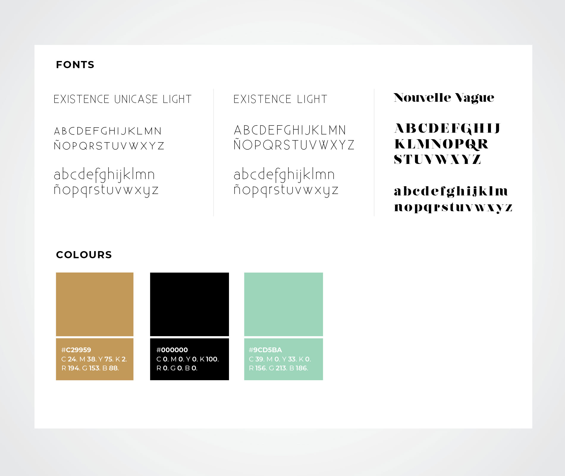
MayWish is a small marketing agency located in Ottawa. The client wanted to revamp its logo keeping the same palette of colours but making it modern and more compelling with the name of the agency. They had a specific idea of what they wanted.
They wanted to reflect in their logo the action of their name which is “making a wish”. The client sent some images as a reference.
I proceed in doing some exploration for the logo based on the design brief received and then presented to the client.
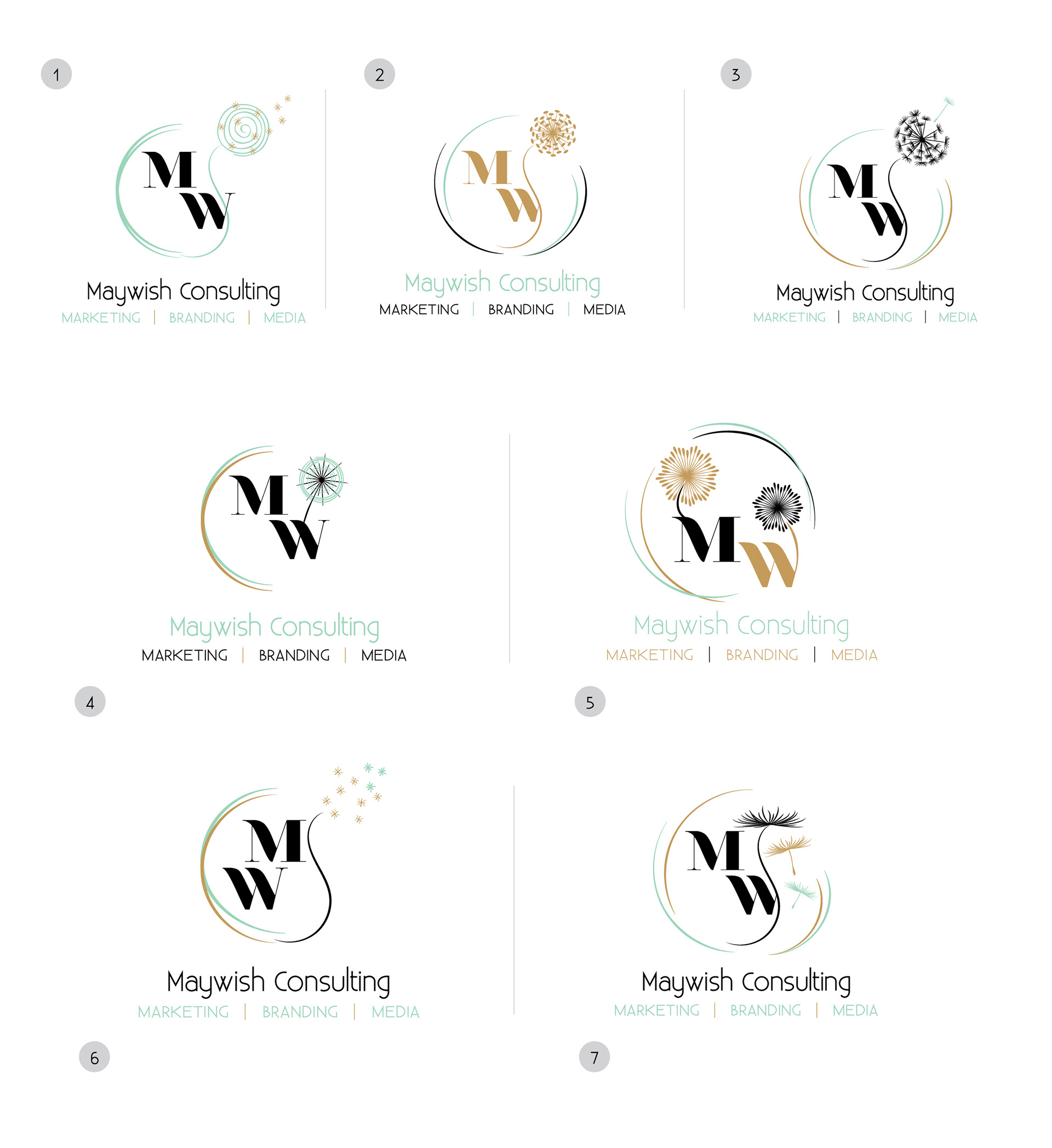
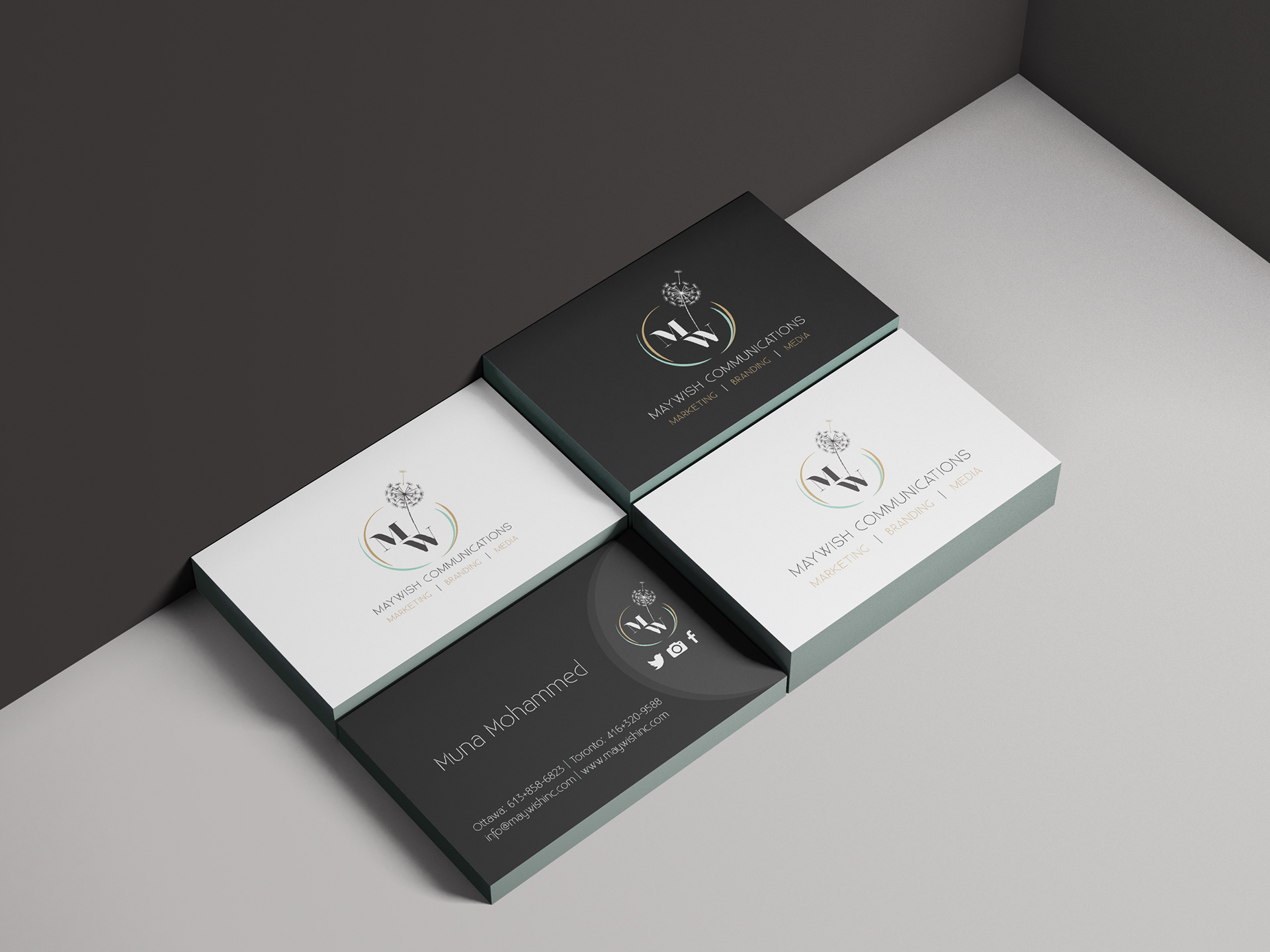
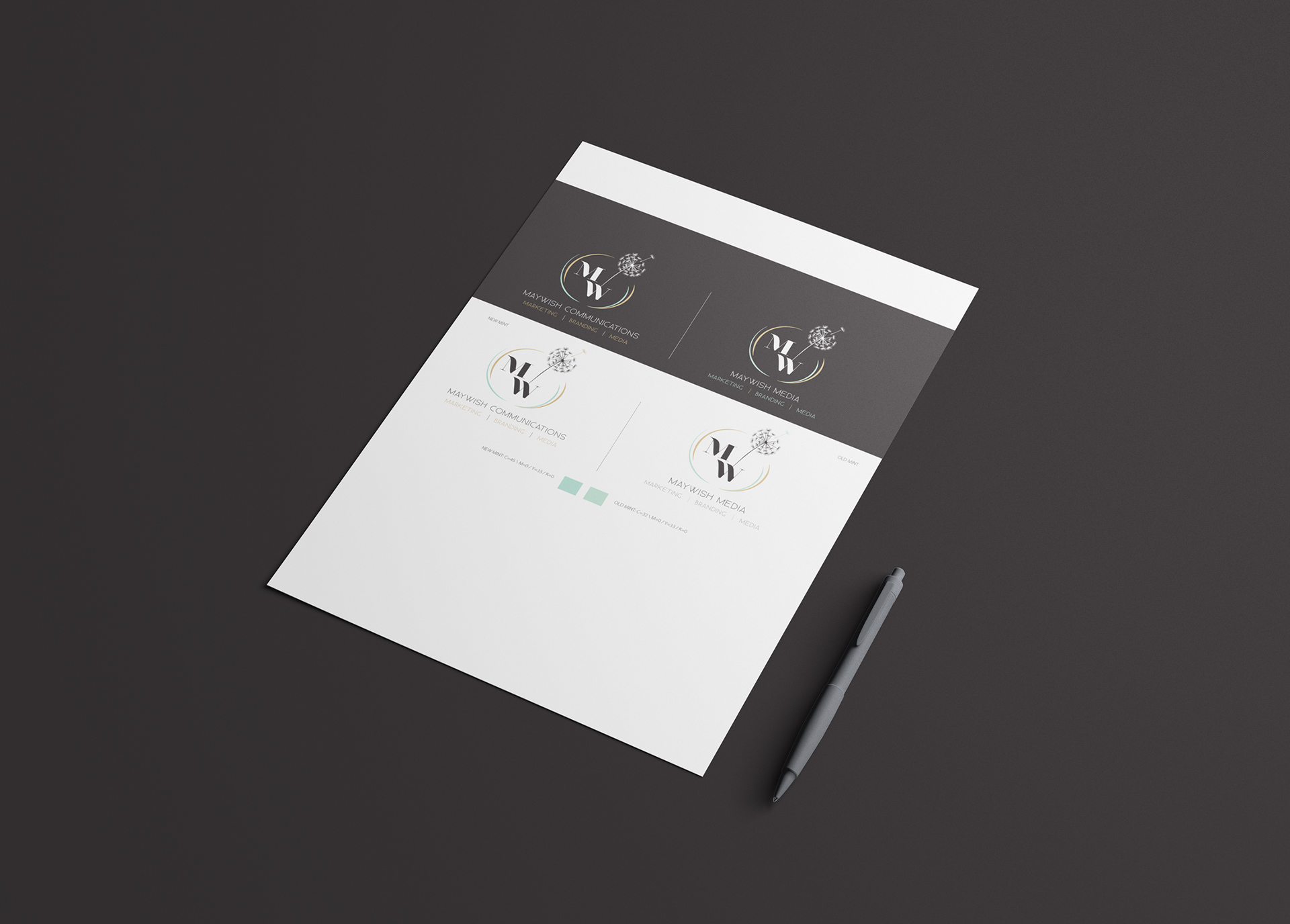
Option three was chosen. In this stage, they wanted to explore some different concepts in their name as well and asked to do more exploration with the option selected and new names for the company. They wanted also to explore how the logo interacts with two different backgrounds: white and black.
Logo study
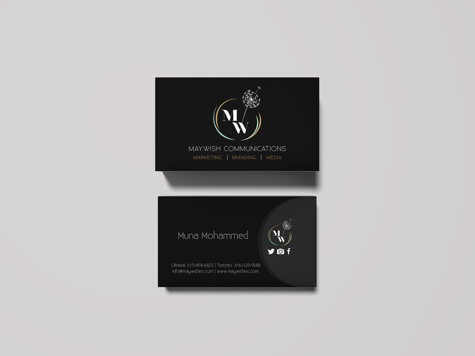
Here is the final logo and new company name.
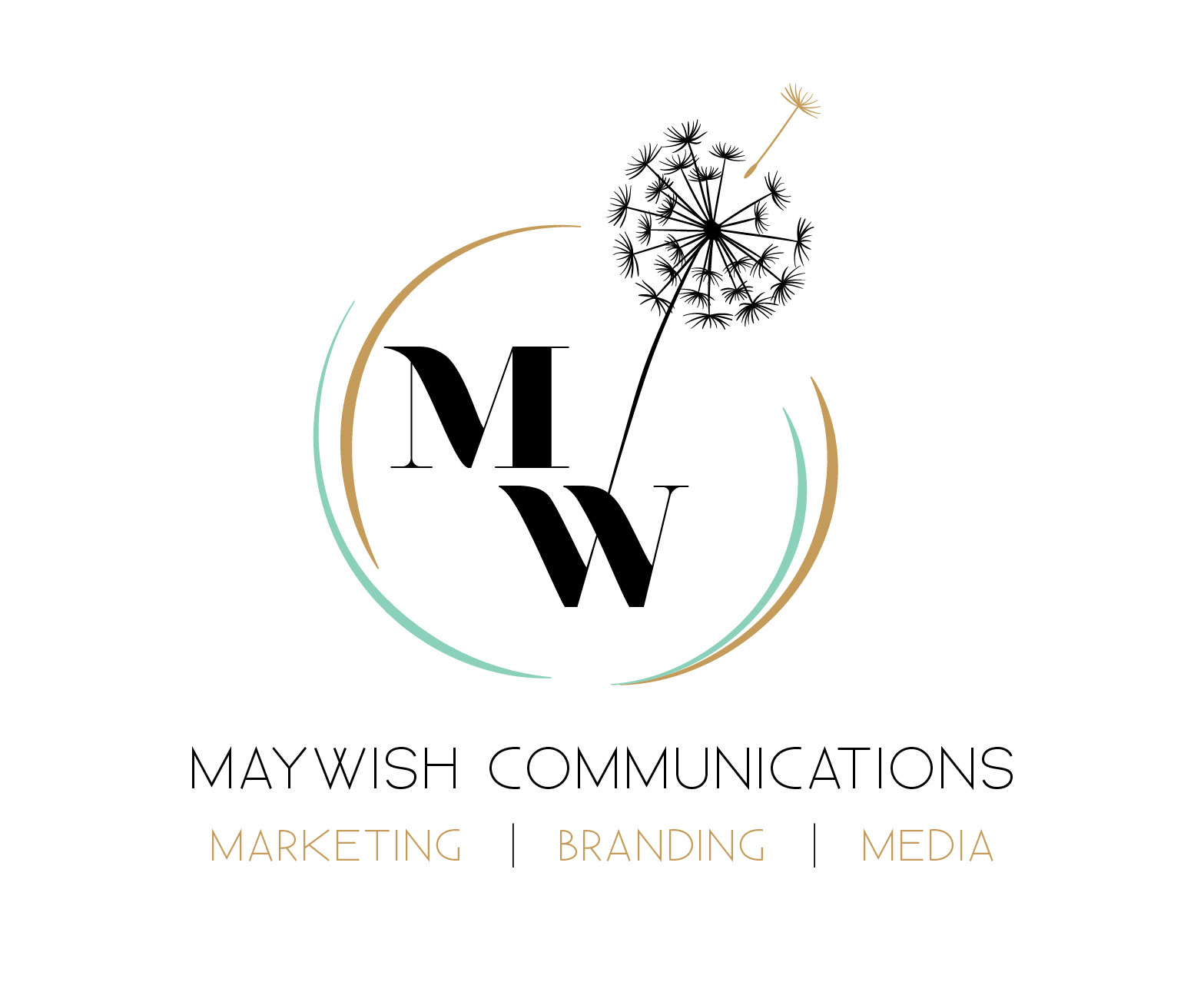
In the end, they decide to have both versions, black and white for their branding.